Case Study
Improving workflow and quality by building the realtor.com design system
While realtor.com is a 20 year old company, it wasn’t using a design system. Because of this, the overall design was fractured as each designer put their own mark on things. This increased project times since the designers would have to poke around to find existing elements or make up their own.
Not having a design system also impacted engineering. The code base is bloated when there are multiple instances of the same type of element. Many times elements are coded fresh instead of quickly using an existing style. Working this way makes things harder for everyone.
It would be a huge asset for designers and developers to have this system in place. So we set out to build and deploy a robust design system that could help everyone.
I was able to find the perfect designer, and together we were able to quickly move forward.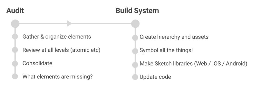
We looked at Airbnb, Salesforce, Google, and Intuit. We also checked out some great articles and guides online to brush up on the latest and best practices.
During this research, we came across Atomic Design.
This is a brilliant system created by Brad Frost. The premise is that all objects are built from smaller simpler objects. Just like in the physical world, atoms form molecules, which combine to create organisms.
Atomic design is a great way to approach a design system because it creates a clear hierarchical structure while allowing for modularity and flexibility.
Here’s a quick breakdown of how it works.
Atoms are the smallest components. These are things like buttons, fonts and text fields. The atoms serve as the basic foundational building blocks.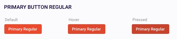 Molecules are made of atoms. Here we can combine atoms to make something a bit more complex, like a search bar.
 Organisms are the next level of complexity. An example of an organism is a listing card which contains a number of other elements.
 From here you build out templates and pages.
That’s the gist of Atomic design.
You can read more this methodology and learn how to implement it for your own design system here.
Taking our current design as a start and using the direction of our other project gave us the understanding of where we are today as well as a guiding light to where we wanted to be.
The first thing we did was to go through all pages and interactions on the site. We took the latest production sketch files and also went through the live site to grab anything that was missing from the files.
We found out that there were a lot of instances where we have multiple flavors of the same component. For example, we had three different primary button styles!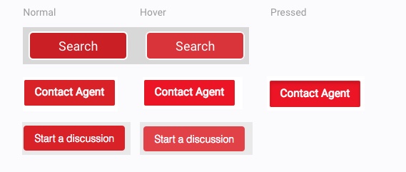 We printed out all of the pages and put them on a wall. By putting all of the pages and elements out in one space, everyone could see how things worked (or didn’t work) as how things combine in an overall system.
This was especially useful at realtor.com because the groups work in a silo approach and are responsible for only one section of the site.
Starting these system conversations is a powerful tool to help your team break out of their silos and better understand how all of the parts work together. We did a workshop where we printed out all of the screen and marked duplicate items and things which weren’t right.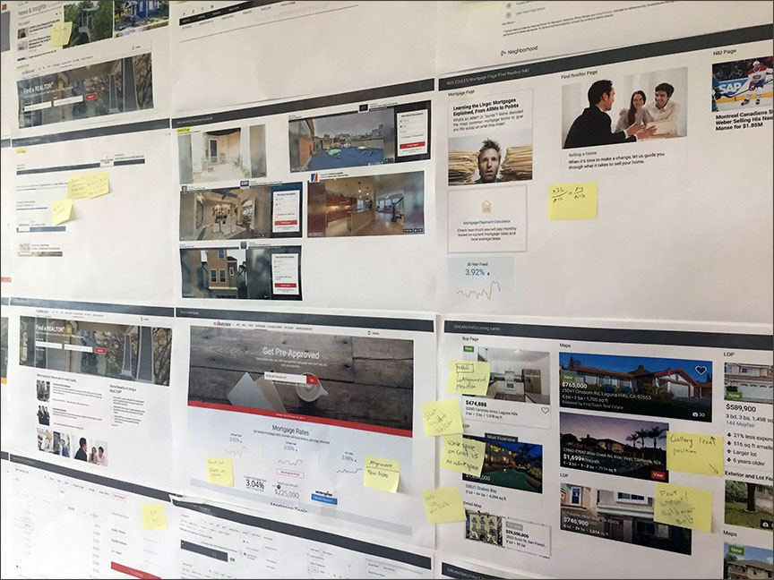 Now we had a big list of duplicated and funky elements to address.
Kat, our designer, and I went through all of the elements together. We consolidated duplicates and evolved other pieces to fit better with our envisioned direction.
As the work came together, we shared with the rest of the team regularly to get their feedback and provide awareness. We also started the conversation of thinking in a systemic manner with all projects going forward. No longer would it just be thinking in silos. Everyone is expected to understand how their area looks and interacts with everything else.
As soon as we put enough elements together for the sketch library, we created this component and shared it with the team. Having this helps immensely in getting people to use the library. It’s now just a matter of a few clicks to have even the most complex components added to a design.
Before this, people had to look around in multiple files, folders and pages to see if something similar was already created.
Now, they can quickly and easily search through all of our elements to find the one that fits their needs.
We put the design system art boards out on invision so our team can quickly look at all of the elements together and understand the landscape of the system.
If you have a design system at your company, but don’t have a sketch library for it, I recommend making one ASAP. It’s wonderful.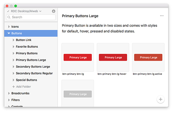 In addition to being usable for the designers, we wanted to bring in the same naming conventions that the developers were using in their code. This way, the two teams can speak the same language. We spent some time with them to see how things were currently named and made some adjustments for the new library. It was a good idea to involve them earlier so that they could get excited about the project and understand what’s coming up in the future.
As with any good project, testing is critical. We released version one of the library and I spent some time applying it to current projects. I was able to find inefficiencies and confusing labels fairly quickly this way.
For example, we use the heart button to save and unsave, but it wasn’t grouped under buttons, even though it was a button.
There wasn’t anything glaringly wrong with the hierarchy, but there were inconsistencies and small bugs which impacted the overall usability.
Kat and I worked together to optimize the hierarchy and were able to eliminate the issues. After this, we shared the library with the greater team for them to test and give feedback.
In addition to sharing the library plugin, we asked the team to review everything and put comments directly into the Invision boards on any feedback/recommendations that they might have.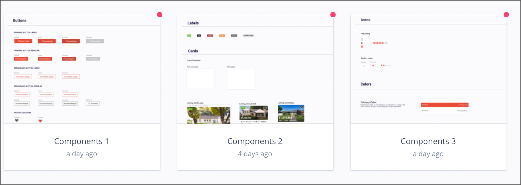 This was really great because it helped to create a group discussion without blowing up everyone’s email accounts with long threads, or just sending private feedback to myself.
After about a week and a half of review/feedback time, we all met to go over the comments and discuss suggestions made by the team members. As a group, we tweaked some of the elements and supported others.
Because of this, the whole group was able to be a part of the system acceptance and contribute to the design.
Afterwards, we began to work with product and engineering to go through our current site and create tickets to start updating elements to align with the new system.
Projects going forward would be using the new styles. Other elements of the site would be updated in future sprints. This way we can update the train while it’s rolling.
Working with the dev and product team we were able to systemically update the site as a whole. The engineers also took this opportunity to reduce some of their own tech debt and clean up our CSS.
The team has gotten a great start in breaking out of their design silos. Having a system has increased our productivity by over 20% since it’s much quicker to simply pull the right component. It also gives our designers more time to spend on the UX of the project.
It made a big impact in engineering with the consolidated style sheet and more reusable code. Developers also have the exact style to reference when they inspect the invision projects since we now use the same naming conventions. This increases their productivity as well.
Building a design system was a large undertaking, and well worth it. Doing this for your own company will pay you dividends across the board and will help your design process become better and faster.
Not having a design system also impacted engineering. The code base is bloated when there are multiple instances of the same type of element. Many times elements are coded fresh instead of quickly using an existing style. Working this way makes things harder for everyone.
It would be a huge asset for designers and developers to have this system in place. So we set out to build and deploy a robust design system that could help everyone.
Team and Role
A design system is a lot of work. Our current team already had their hands full with projects, so I hired a junior UX designer to help me implement this. My thought was that I could leverage my architecture knowledge and experience with her efforts and the teams input to put something together fairly quickly.I was able to find the perfect designer, and together we were able to quickly move forward.
The Plan
A design system is a huge undertaking. It’s doubly complex when you have years of design debt to tackle. So the first thing we did was to come up with a game plan for the project.
Going Atomic
Design systems come in many different flavors. The first thing we did was to find and study some of the best design systems around.We looked at Airbnb, Salesforce, Google, and Intuit. We also checked out some great articles and guides online to brush up on the latest and best practices.
During this research, we came across Atomic Design.
This is a brilliant system created by Brad Frost. The premise is that all objects are built from smaller simpler objects. Just like in the physical world, atoms form molecules, which combine to create organisms.
Atomic design is a great way to approach a design system because it creates a clear hierarchical structure while allowing for modularity and flexibility.
Here’s a quick breakdown of how it works.
Atoms are the smallest components. These are things like buttons, fonts and text fields. The atoms serve as the basic foundational building blocks.
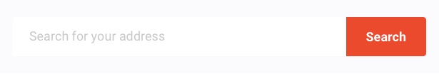
Molecules are made of atoms. Here we can combine atoms to make something a bit more complex, like a search bar.
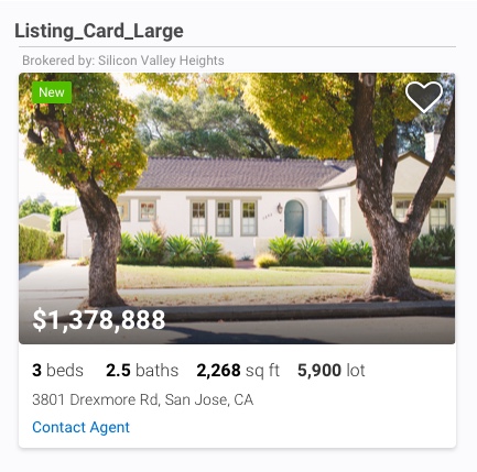
Organisms are the next level of complexity. An example of an organism is a listing card which contains a number of other elements.
From here you build out templates and pages.
That’s the gist of Atomic design.
You can read more this methodology and learn how to implement it for your own design system here.
System direction
A few months earlier, we had a big initiative project which included a fresh take on our look and feel. The team liked how this was turning out and we decided to use it as the direction for our core design system. It is based on material design with the addition of unique realtor.com styling and elements. The overall feel is clean, fresh, and modern.Taking our current design as a start and using the direction of our other project gave us the understanding of where we are today as well as a guiding light to where we wanted to be.
Audit
Since we had an existing product, it made sense to audit what we have.The first thing we did was to go through all pages and interactions on the site. We took the latest production sketch files and also went through the live site to grab anything that was missing from the files.
We found out that there were a lot of instances where we have multiple flavors of the same component. For example, we had three different primary button styles!
We printed out all of the pages and put them on a wall. By putting all of the pages and elements out in one space, everyone could see how things worked (or didn’t work) as how things combine in an overall system.
This was especially useful at realtor.com because the groups work in a silo approach and are responsible for only one section of the site.
Starting these system conversations is a powerful tool to help your team break out of their silos and better understand how all of the parts work together. We did a workshop where we printed out all of the screen and marked duplicate items and things which weren’t right.
Now we had a big list of duplicated and funky elements to address.
Kat, our designer, and I went through all of the elements together. We consolidated duplicates and evolved other pieces to fit better with our envisioned direction.
As the work came together, we shared with the rest of the team regularly to get their feedback and provide awareness. We also started the conversation of thinking in a systemic manner with all projects going forward. No longer would it just be thinking in silos. Everyone is expected to understand how their area looks and interacts with everything else.
As soon as we put enough elements together for the sketch library, we created this component and shared it with the team. Having this helps immensely in getting people to use the library. It’s now just a matter of a few clicks to have even the most complex components added to a design.
Before this, people had to look around in multiple files, folders and pages to see if something similar was already created.
Now, they can quickly and easily search through all of our elements to find the one that fits their needs.
We put the design system art boards out on invision so our team can quickly look at all of the elements together and understand the landscape of the system.
If you have a design system at your company, but don’t have a sketch library for it, I recommend making one ASAP. It’s wonderful.
Library Hierarchy
A big part of the usability of the library is the hierarchy. This is the menu list that the user uses to find the elements they need.
In addition to being usable for the designers, we wanted to bring in the same naming conventions that the developers were using in their code. This way, the two teams can speak the same language. We spent some time with them to see how things were currently named and made some adjustments for the new library. It was a good idea to involve them earlier so that they could get excited about the project and understand what’s coming up in the future.
As with any good project, testing is critical. We released version one of the library and I spent some time applying it to current projects. I was able to find inefficiencies and confusing labels fairly quickly this way.
For example, we use the heart button to save and unsave, but it wasn’t grouped under buttons, even though it was a button.
There wasn’t anything glaringly wrong with the hierarchy, but there were inconsistencies and small bugs which impacted the overall usability.
Kat and I worked together to optimize the hierarchy and were able to eliminate the issues. After this, we shared the library with the greater team for them to test and give feedback.
In addition to sharing the library plugin, we asked the team to review everything and put comments directly into the Invision boards on any feedback/recommendations that they might have.
This was really great because it helped to create a group discussion without blowing up everyone’s email accounts with long threads, or just sending private feedback to myself.
After about a week and a half of review/feedback time, we all met to go over the comments and discuss suggestions made by the team members. As a group, we tweaked some of the elements and supported others.
Because of this, the whole group was able to be a part of the system acceptance and contribute to the design.
Afterwards, we began to work with product and engineering to go through our current site and create tickets to start updating elements to align with the new system.
Projects going forward would be using the new styles. Other elements of the site would be updated in future sprints. This way we can update the train while it’s rolling.
Working with the dev and product team we were able to systemically update the site as a whole. The engineers also took this opportunity to reduce some of their own tech debt and clean up our CSS.
Outcome
The design system was a big success. It elevated our look and feel across the site and gave us a unified resource for design.The team has gotten a great start in breaking out of their design silos. Having a system has increased our productivity by over 20% since it’s much quicker to simply pull the right component. It also gives our designers more time to spend on the UX of the project.
It made a big impact in engineering with the consolidated style sheet and more reusable code. Developers also have the exact style to reference when they inspect the invision projects since we now use the same naming conventions. This increases their productivity as well.
Building a design system was a large undertaking, and well worth it. Doing this for your own company will pay you dividends across the board and will help your design process become better and faster.