Case Study
Search Filters at Realtor.com
Challenge
My first project at realtor.com was to work with a new designer on my team and overhaul our filters.The current implementation of filters was clunky and didn’t give the user an easy way to access all of our filter options. Realtor.com has a wide array of additional filters, which were not easily discovered by our users.
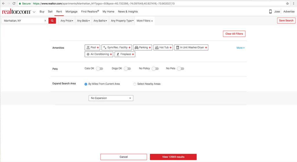 In this screen, the user is only shown 3 filter types. They have to click the “More+” link to reveal the additional filters.
This design hid the filters behind a text link which wasn’t very intuitive or noticeable.
Also, it looks like More+ will give the user more amenities to select. Instead, clicking More+ will reveal things that aren’t just amenities such as the number of stories the building has, community features and more.
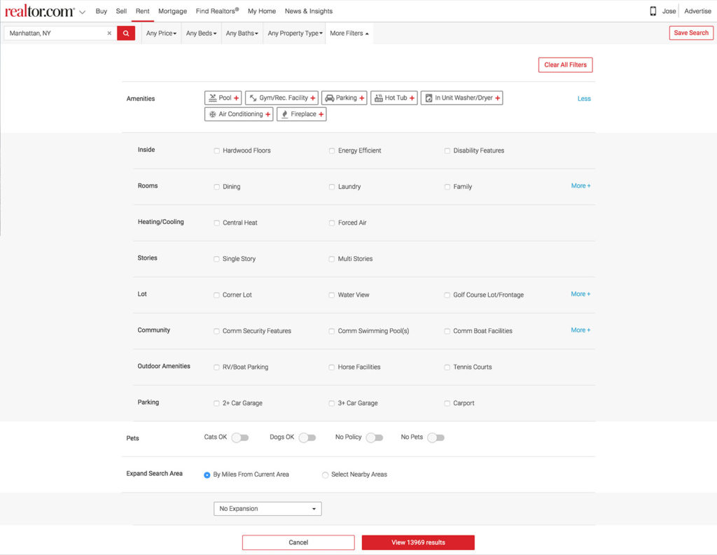 In addition to this issue, the overall design looked clunky, was hard to scan and was not very useful for our users.
Realtor.com has more filters than most of the competitors, but this design was doing a poor job showing it.
So, our task was to redo the filter experience as well as to add additional filters for our users.
The Team and Role
For this project, I worked together with a senior designer on the team who started a week ago. We were both very new to the company and this was a great first project to start with.Process
After we did an initial heuristic analysis on the current experience, we spent some time looking at the competition. We looked at Zillow, Trulia, Compass and many others. We also looked at other search platforms such as eBay and Yelp.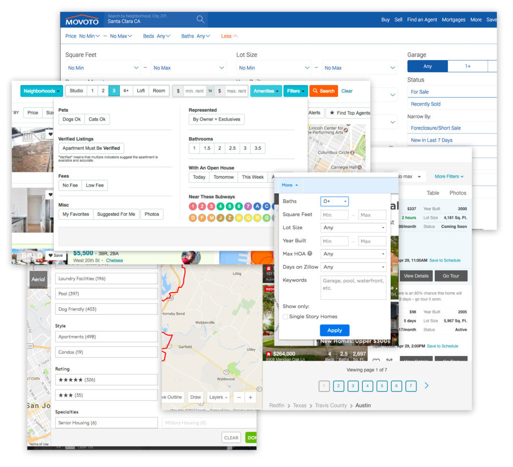 We performed some user testing on our current experience with our research team and looked at filter usage metrics. From here we learned that the current hierarchy of the filters matches what people were looking for. The more popular sections and filters were on top and the least popular were on the bottom.
One of the things that I helped spearhead was a mobile first initiative. Before then, the team designed for desktop first and then designed for mobile web.
Knowing that mobile devices are more and more prevalent, plus Googles drive to mobile first search, we wanted to ensure that the best experience will be on mobile web. So we designed first for the mobile experience and then leveraged that to the desktop.
We looked at our native apps to see what that experience was like.
 While we liked the stacked elements, we didn’t feel that the design at the time was very polished or inviting. It also has some large gaps between containers which increases the user scroll.
We wanted a clean, minimal and modern design for our new filters.
The initial wireframes reflect this new approach.
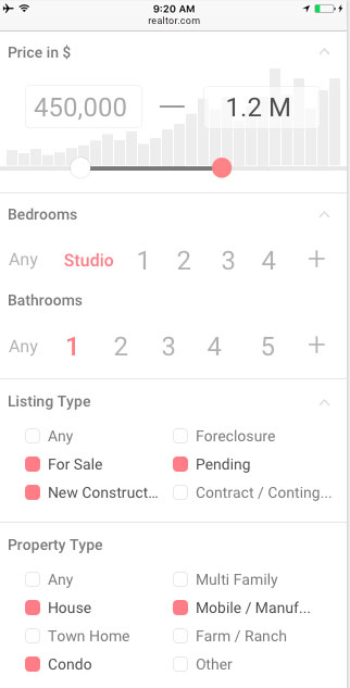 For pricing, we used the slider with histogram to help the user set the best price range to get the most results.
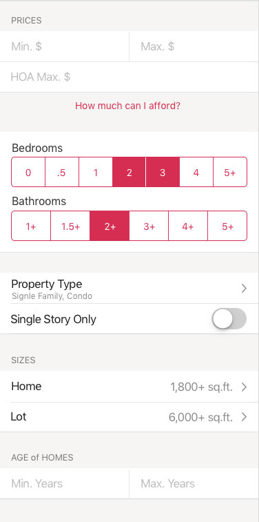
Bedrooms and Bathrooms are primary filters with 7 options. So we decided to make the option selections large and inviting with plenty of space for maximum scanability.
Each section is clearly listed and we reduced the amount of horizontal space.
As the project developed, we made some adjustments to deliver a great filters UI.
 We increased overall contrast of the elements, adjusted spacing, and slightly separated cards that belonged to different groups. The visual separators made it easier for users to differentiate groups of filters.
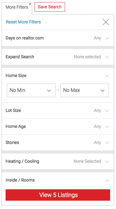
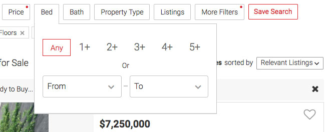 In the desktop version, the main filters are broken out separately and launched with their own buttons. We kept the same UI as the mobile version of these sections. Clicking the button opens the filter panel for that particular filter.
Filter Notification
An early problem we solved was how to let the user know that one or more filters has been selected. We wanted a simple solution that wasn’t too strong visually.First, we experimented with having the red ghost button indicate the filter was on and also renaming the label to reflect the filter setting.
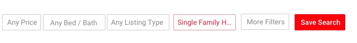 However, we quickly saw that this wasn’t the best approach.
It didn’t match our pattern for ghost buttons. It was too strong of an indicator. And most of the labels had to be truncated, which reduced the usefulness.
However, we quickly saw that this wasn’t the best approach.
It didn’t match our pattern for ghost buttons. It was too strong of an indicator. And most of the labels had to be truncated, which reduced the usefulness.
We thought of using the notification pattern, but felt that the extra info of how many filters you have selected doesn’t add much value. This also is too much for the main filters which just have one thing to select anyway. We did like the smaller visual footprint compared to highlighting the entire button.
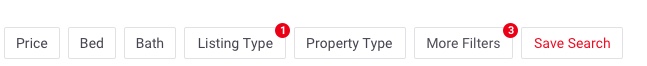 So we minimized this pattern to just show a red dot on filters that have been activated. This gave us a small footprint that still conveyed the concept that something was selected.
 Our idea was shared internally to see if it was clear, and then we did remote testing with usertesting.com to see if our wider audience understood what the indicator meant. The tests were successful and we were happy that we found an elegant solution to the problem.
Pricing Slider
Another experiment that we wanted to try was to add a slider as an alternative to selecting price range. The current implementation was two text fields, one for the lowest price and the other for the highest.This is bad because people have to fully type both entries in. It doesn’t give them any quick shortcuts to things like popular ranges. It also doesn’t help them understand what price ranges are available for their area.
Additionally, mobile users don’t exactly love to type and this was not a mobile friendly design.
After exploring some different directions, we thought the slider would be a great alternative to give people a wider range of price options.
We also thought it would be amazing to have a histogram which would help the user see availability based on the range they are selecting.
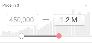 This combination would solve a big problem users have, which is that they may enter a price range which yields little or no results. It also gives them added context of the average price ranges in the market for the type of house they are looking for.
As we designed the project, we did informal tests within the office and watched as people interacted with our mocks and designs. We also did user testing in our lab where we had people use the app and give feedback.
Results were positive overall. The users could adjust the criteria that we tasked them to do, and everyone was able to use and understand the slider.
The team was super excited to include this great pricing widget that no one else had. Then we showed it to the engineers and found out why no one else is doing this.
While the histogram looks great and is super useful, it’s also a big load on performance. Our dev lead told us that it would be a huge performance hit to figure out the volume of all price ranges each time the user opens the filter.
Even though we had to dial back the design a bit, it was great that we reached for the stars and stretched our minds on what could be.
Things were looking good for the slider so far, but we shortly came to another snag.
As we were coding it, our engineers mentioned that they were having a hard time making it functional.
Because we had so many data points on the slider to accommodate price ranges, it was over sensitive.
We did further study on the best UX of a slider and found that ticks should be at least 32px from each other for ease of use. This is about 10 data points. We had 20. So, we reduced the level of data points, which solved the sensitivity issue, but made the functionality more restrictive.
While the developers were looking into the slider on a code level, we did a quick ideation session to see what else we could do if the slider wasn’t able to be built.
How could we give the user the ability to quickly enter two price ranges without typing while helping them understand what prices best represented what’s in their local market?
Our backup solution to this is the design below.
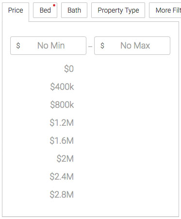 The user can quickly see the most popular price ranges. By clicking on one of these suggested prices, the input field above is filled with it and a second set of options appear for the max price.
At any time, the user can also enter their min and max price by tapping on the respective text field.
This new approach tested well. Users understood the interaction and liked that we helped them with popular price options.
So, we decided to use the drop down and put the slider below it as an alternative input method. We’d monitor the usage of both and make a call after more of our audience used them. We weren’t able to add a variant for each at the same time, so this was the quickest way to test in parallel.
Deployment
One surprising thing we saw was that usage of the slider was dramatically lower than the drop downs. Because of this, we removed the slider to save space and eliminate redundancy. It was a great experiment and a good lesson about testing results at a small vs large scale.As we built out the app and ran AB tests, we saw that filters were being used well and our feedback was positive. We saw a 4 point increase on our customer satisfaction score, which was great! It was widely used on mobile web as well as desktop. Our leads conversion went up by 2% which will net us an additional 2MM yearly in revenue.